

Portland Hearts Of Pine - Lighthouse Kit
Feb 4, 2025
Portland Hearts of Pine have already cemented themselves into the national soccer conversation and they had done it before they had even finished their first season of play. Here for their second year, and definitely avoiding a sophomore slump, Hearts have come out of the gate swinging with another iconic kit.
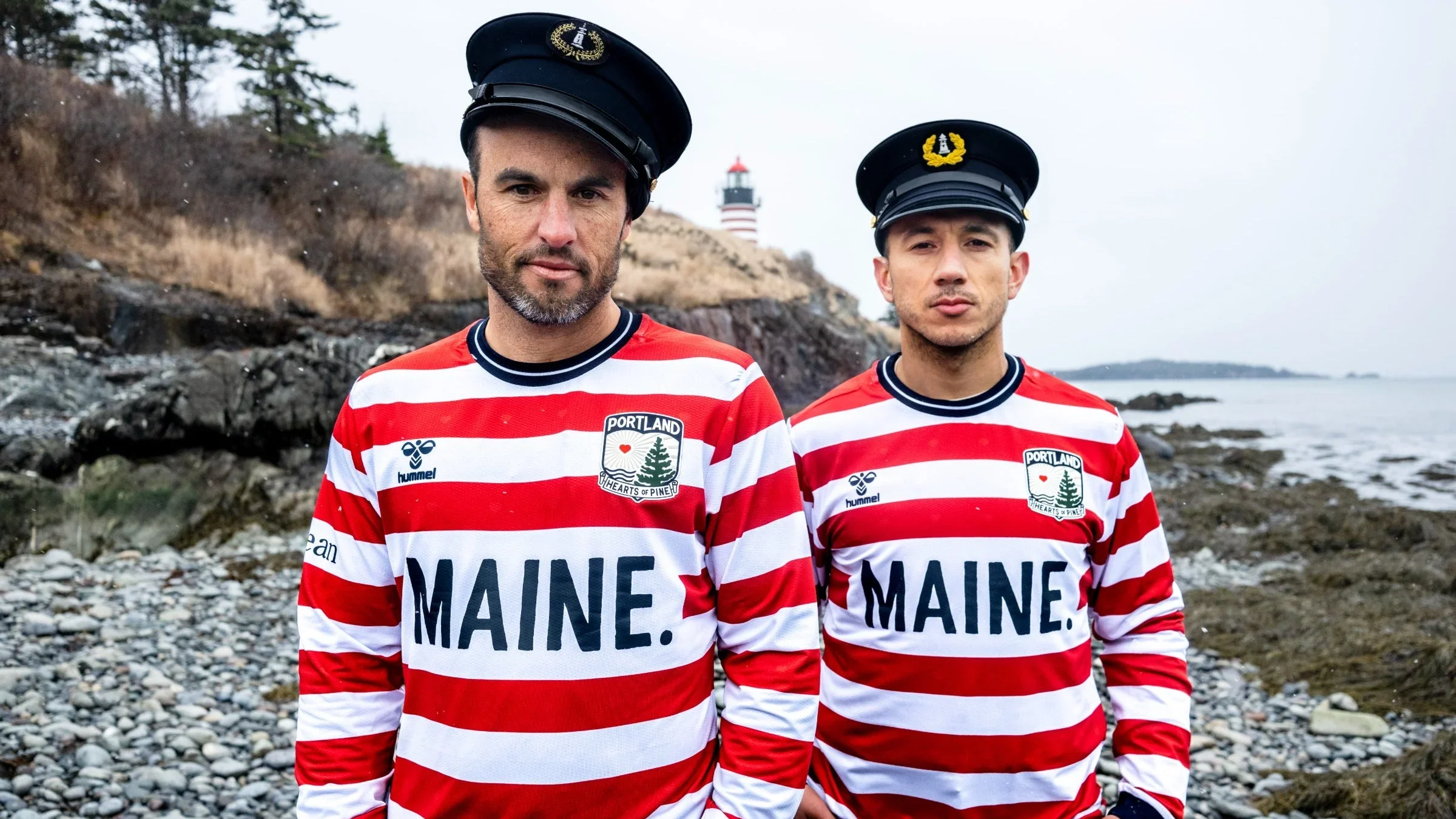
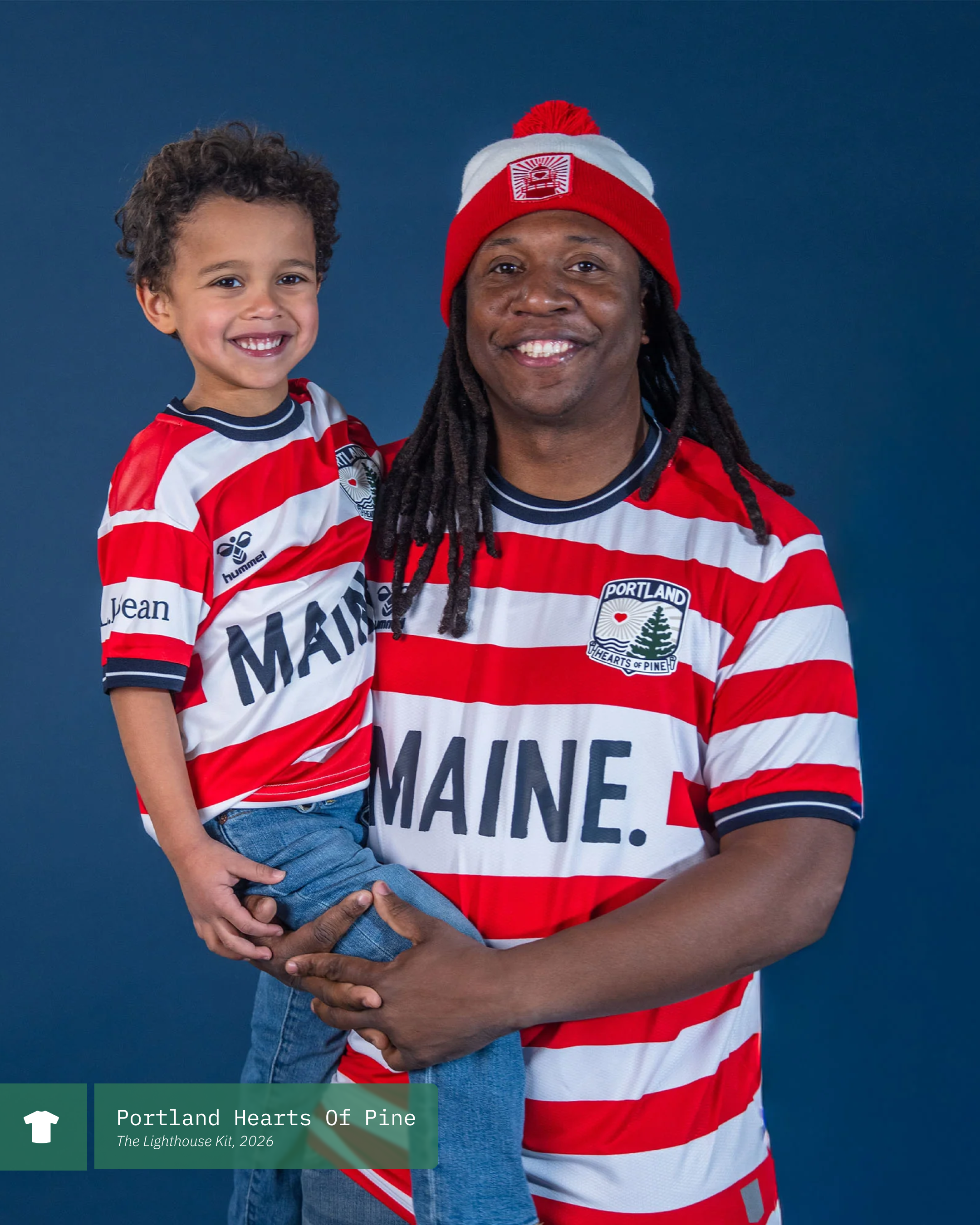
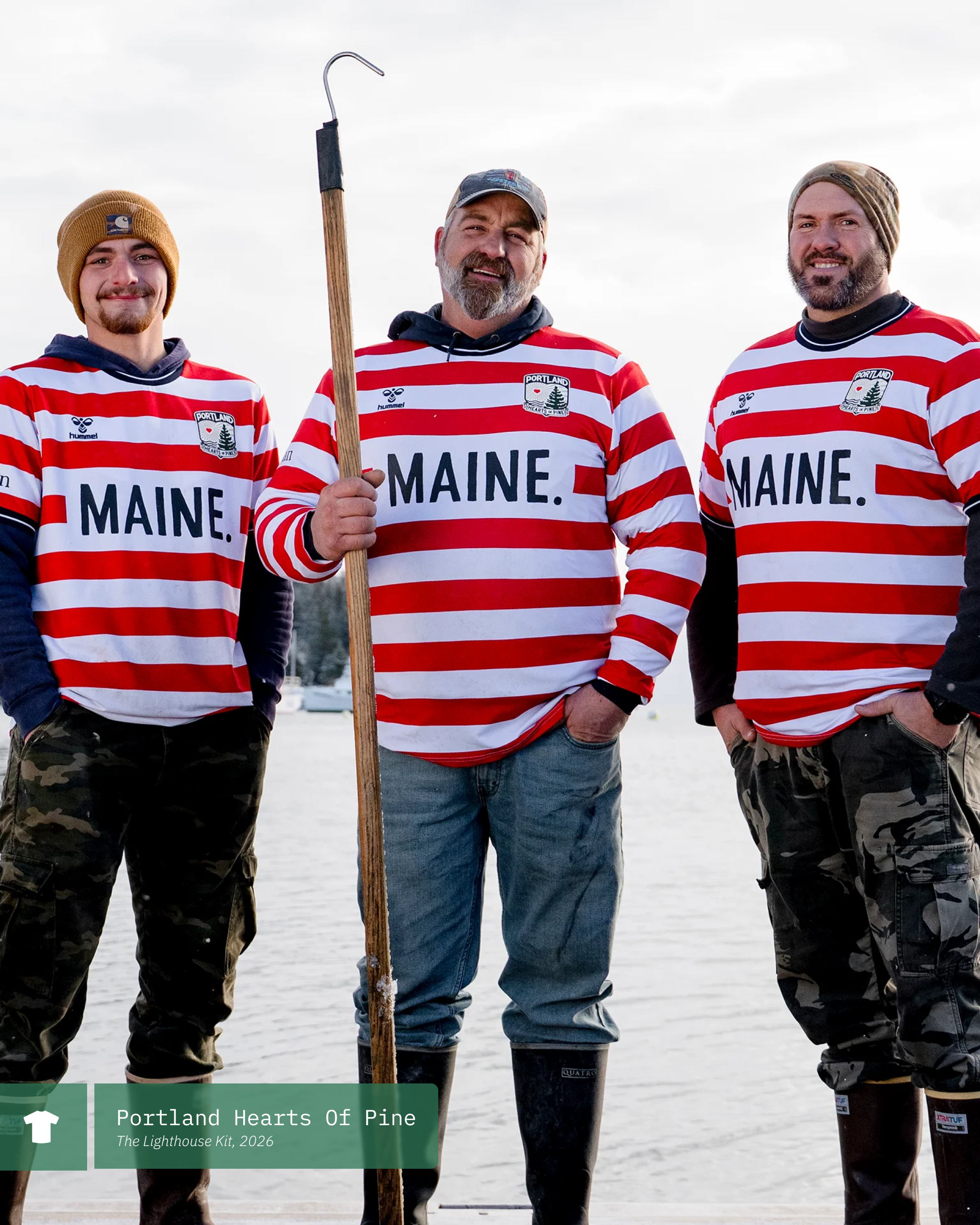
Utilizing the West Quoddy Head lighthouse AND the 2012 US National Team as inspiration, Hearts released The Lighthouse Kit a month ago. The release nearly broke the internet as every part of it was met with mountains of praise.
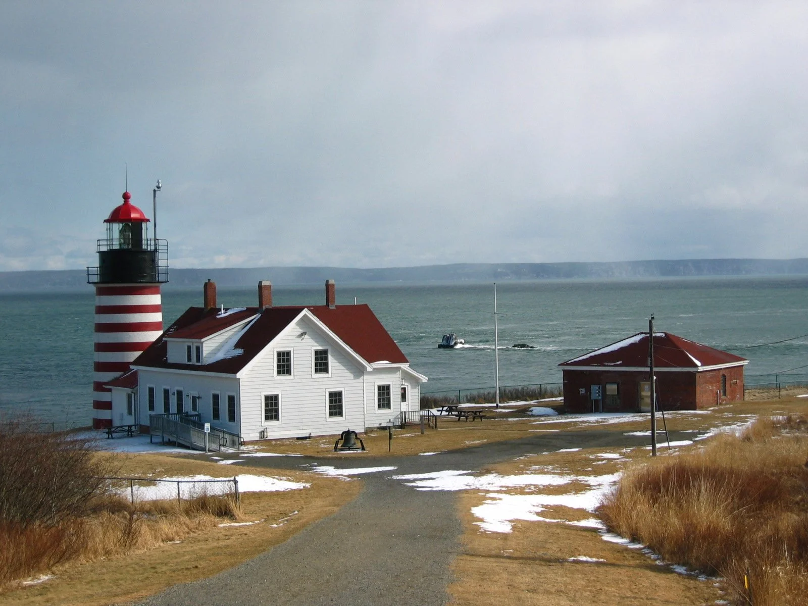
West Quoddy Head Lighthouse
You see, Portland have a well established track record at this point after all three of their inaugural season kits were met with praise as well. The Inaugural home kit was a stunningly bold Navy and Forest Green stripped shirt with beautiful red/orange highlights in the collar and cuffs. The Bandit kit, which served as their away kit, was a simple predominately white kit with a repeating heart pattern. And finally, the Blaze kit, featuring a stunning hunters camo. All three kits featured incredible photoshoots that not only provided legitimacy to the first year third division club, but helped cement visual identity of who Hearts is.
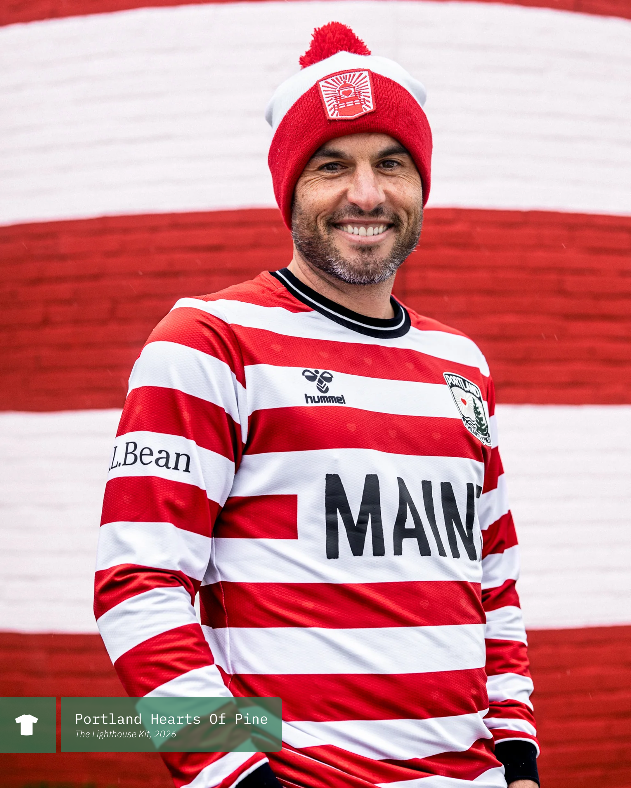
As mentioned above, the kit takes its cues from the West Quoddy Head lighthouse, featuring the same red and white horizontal stripes. The kit features 16 of these stripes, one for every county in Maine! In addition to the lighthouse, there are definitely props given to the 2012 US jersey worn by both the Men’s and Women’s teams, so it was only fitting that USMNT star and American soccer legend Landon Donovan played a massive role in the launch.
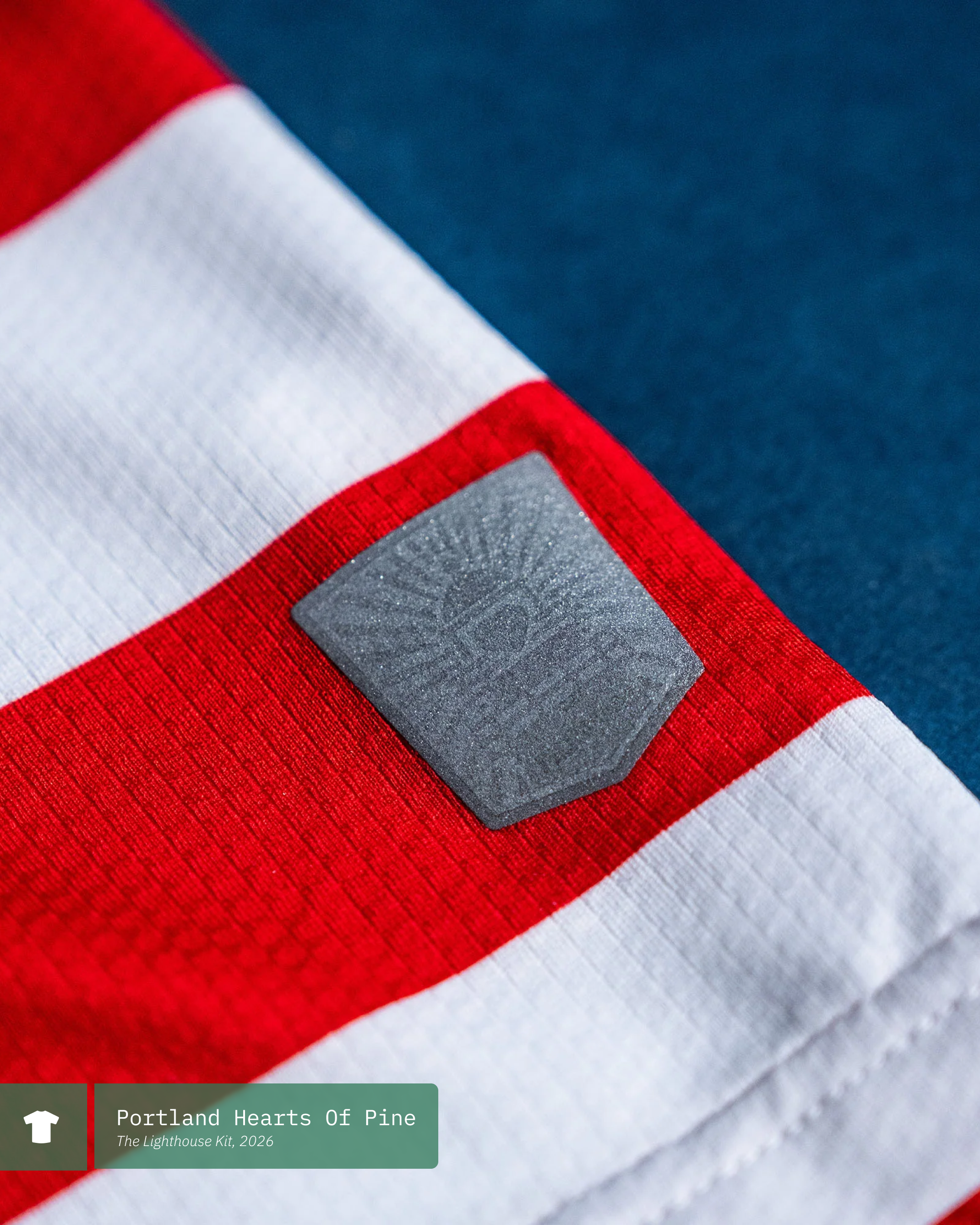
The original branding work for Hearts was done by Hugh McCormick of Colorado. The club went back to him in order to have a lighthouse specific version of the Dirigo Heart logo. This new mark which is now part of the overall brand language can be found as a hip tag on the jersey and in other merch items like the winter hats shown below.
Hearts have yet again made something magical and are one of the clubs really pushing American soccer forward with their strong visual identity. This lighthouse kit is a winner and I will need to get my hands on one asap.
What do you think? Have you picked one up yet? Let us know in the comments below!
Videos
The official brand reveal video
Our video covering some of the newest kits in USL League One
New York Cosmos - 2026 Kits
Feb 2, 2026

Is the third time the charm? That’s the hope! The New York Cosmos are on the verge of making their return (again!), this time to USL League One in the third division of American club soccer.
With their first season back on the pitch just around the corner, they have actually become the first club to officially release both their home and away kits for the new campaign. Let’s take a look at the newest iteration of this storied club and how they’ll be taking the pitch in the new year.
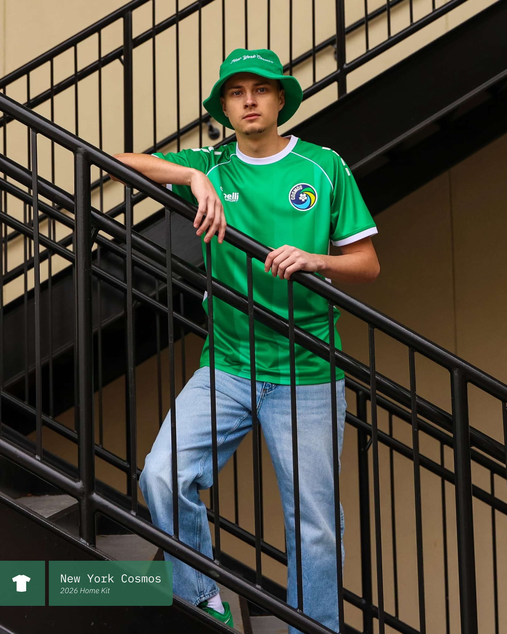
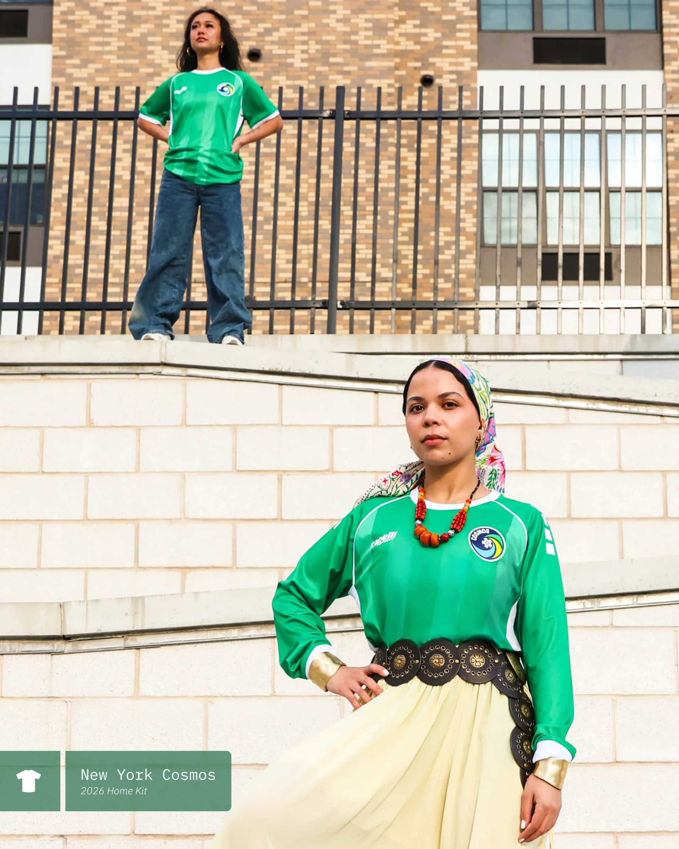
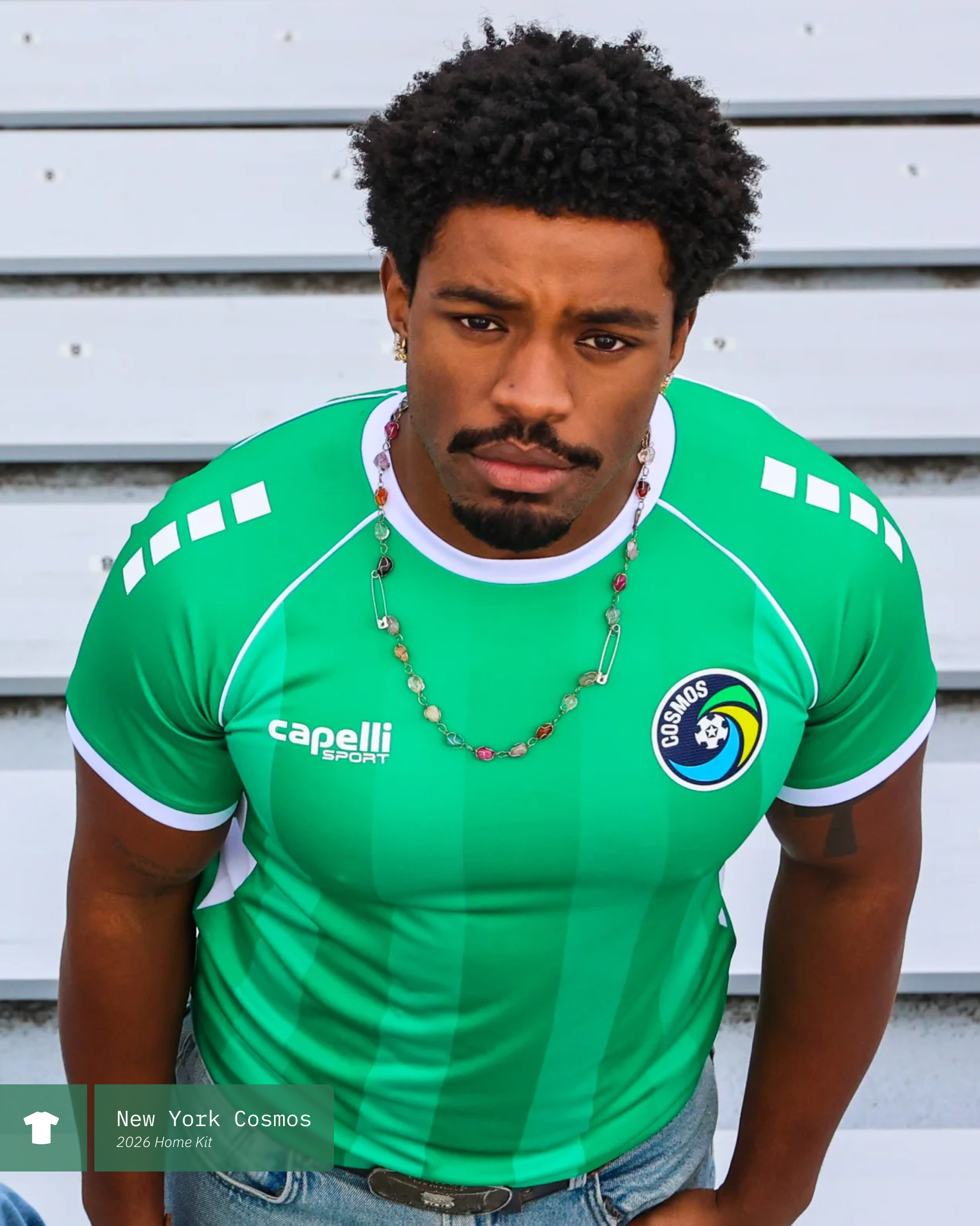
The home kit stays true to a long tradition of utilizing a predominately green shirt as you can see above. For 2026, the club has gone with thick vertical stripes of contrasting shades of green. This is accented by a simple white collar and cuffs. White piping on the raglan sleeves meets a patch of white under the arms.
As of right now, there is no jersey sponsor for either the home or the away. If one is introduced at some point during the season, it will be interesting to see how that is handled and how that would affect the overall look of the kit. Speaking of the overall kit, we have not seen which shorts will be used with this shirt. Both previous iterations have paired white shorts with the green top and I hope we see that continue here - fingers crossed!

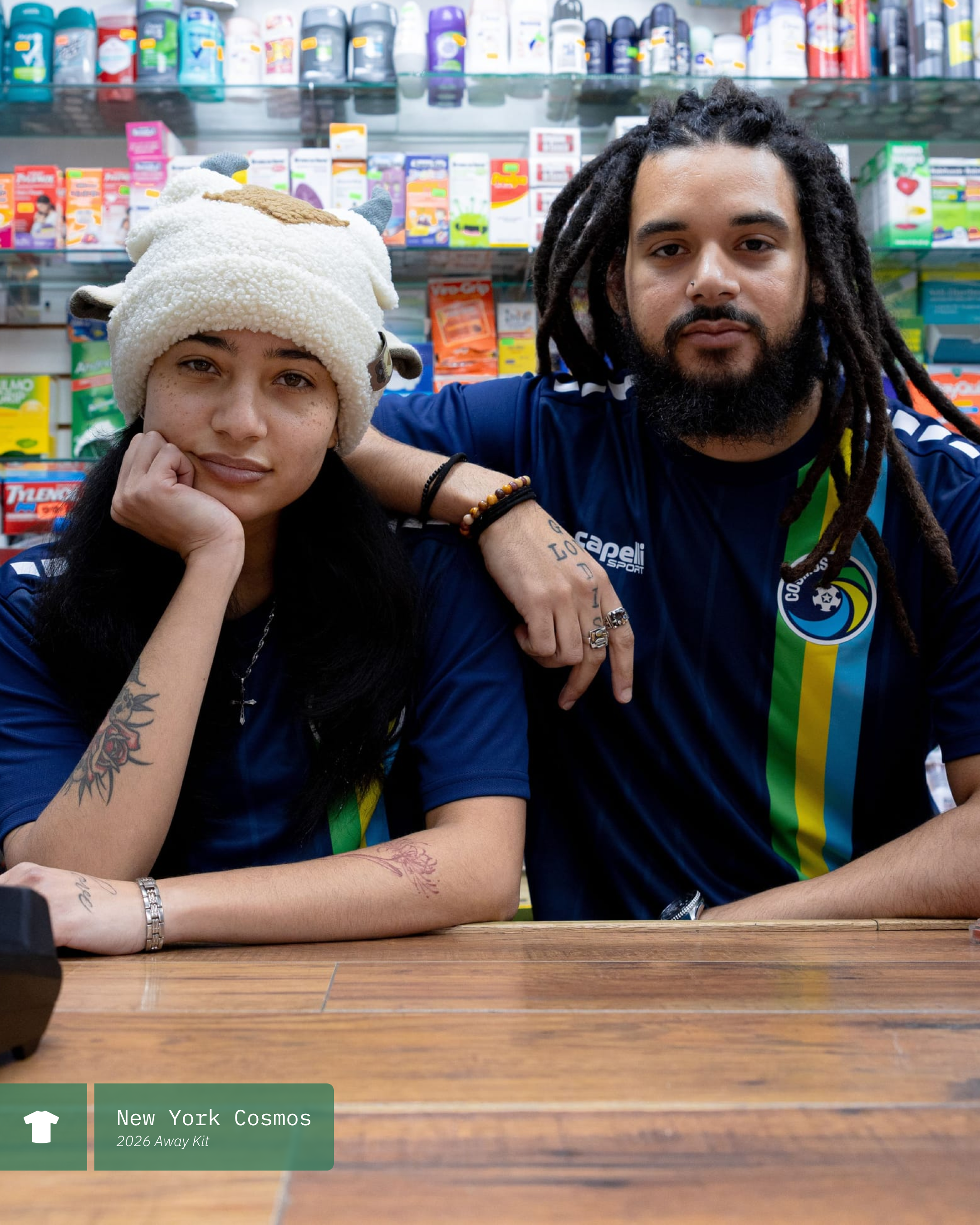
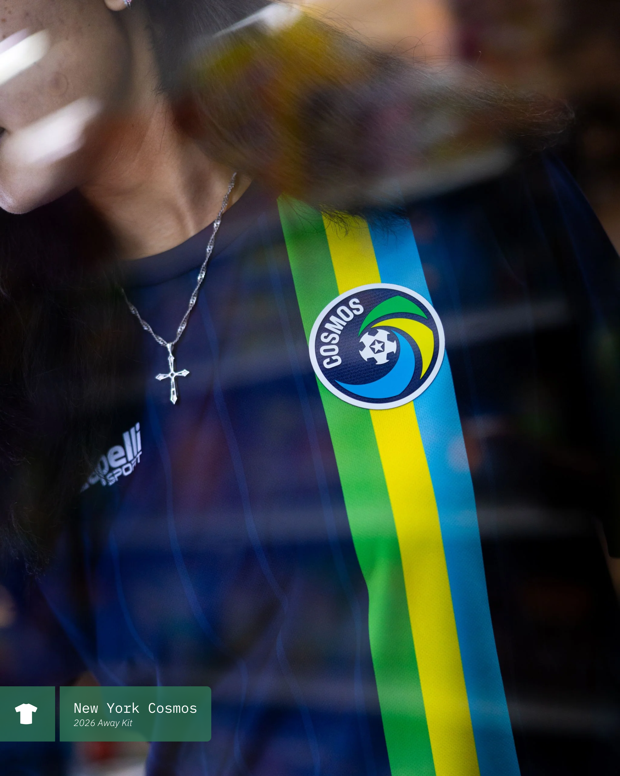
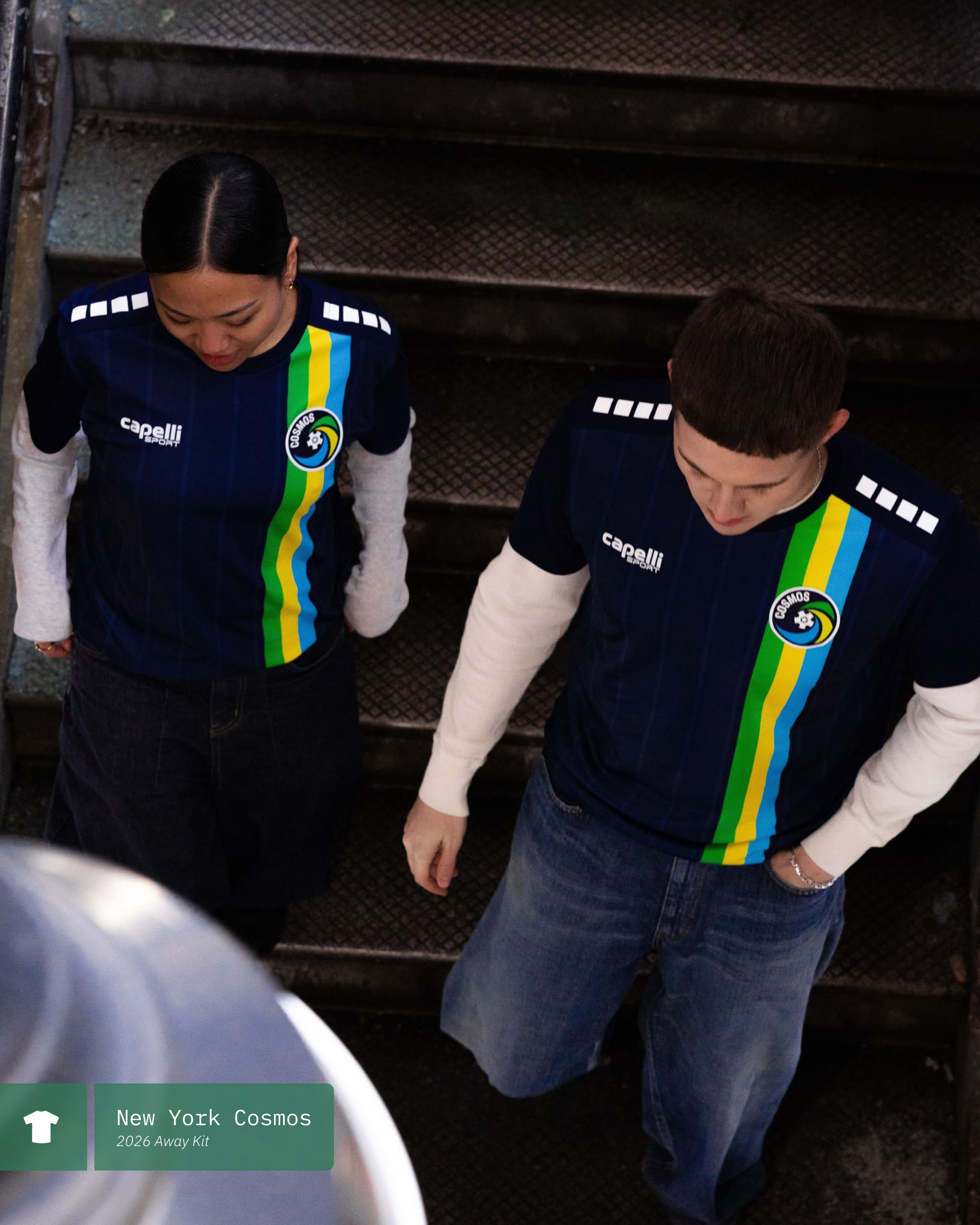
The away kit that was just released pulls its entire color profile from the Cosmos logo itself. A Navy shirt with thin vertical pinstripes of a contrasting shade of blue serves as the base while a very bright multi-colored vertical sash runs top to bottom, aligned with the club crest.
The navy base is the same navy as the background for the crest and each of the three colors in the sash are pulled from the “pinwheel” elements of the crest as well. I really like this shirt. I don’t believe that we have seen the Cosmos utilize this look before as they typically go with an all white kit for their away strip.
As mentioned above, there is no front of shirt sponsor featured at the moment. The home shirt has plenty of open space to accommodate one in the future - the away strip on the other hand is another story. Hoping they don’t have to figure out how to fit on a sponsor on this one but you know, business is business.
Overall I would say this is a really solid reintroduction. There isn’t anything groundbreaking here but I know that I am looking at the New York Cosmos when I see these. What are your thoughts? Have you grabbed one or both? Are you going to? Let me know in the comments!
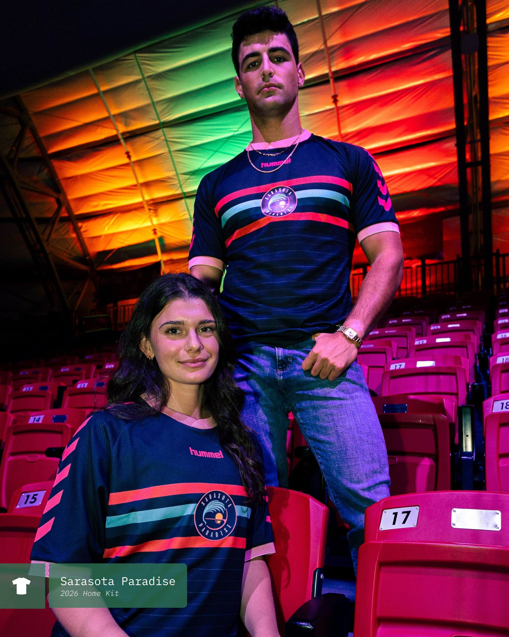
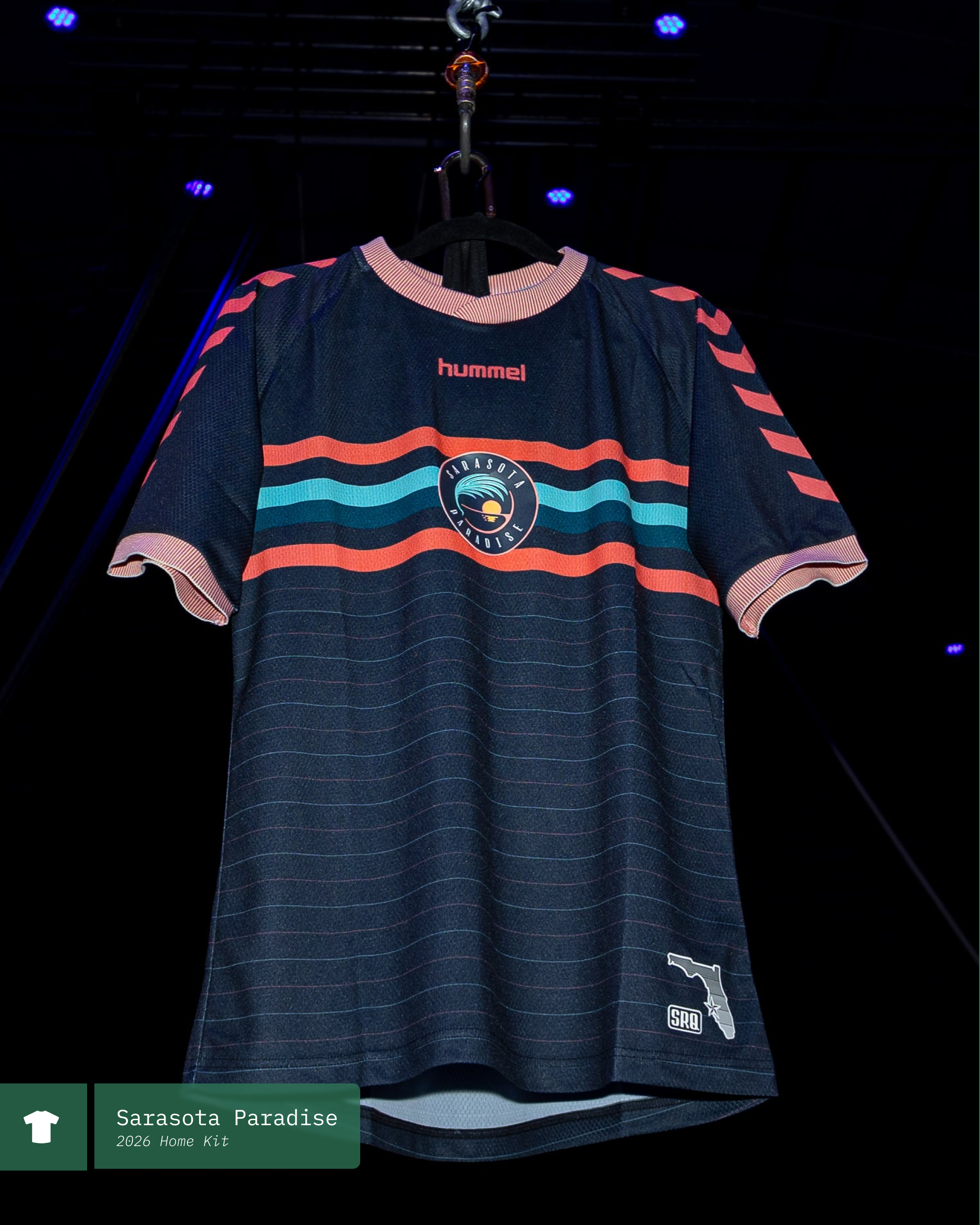
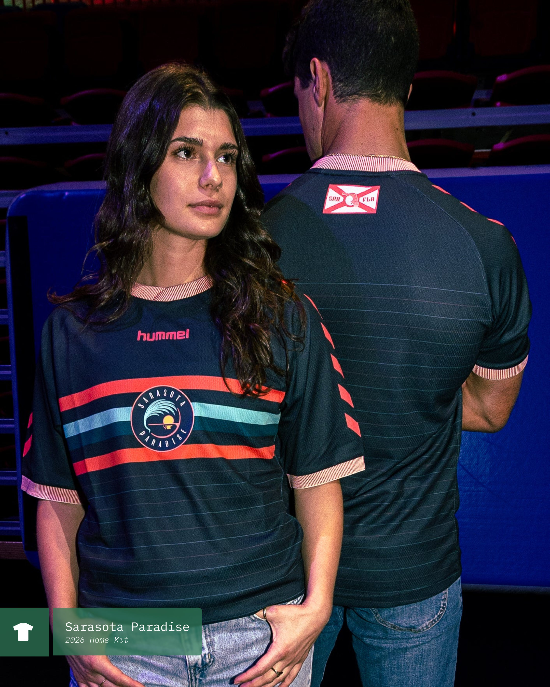
Sarasota Paradise - ‘26 Primary
Jan 8, 2025

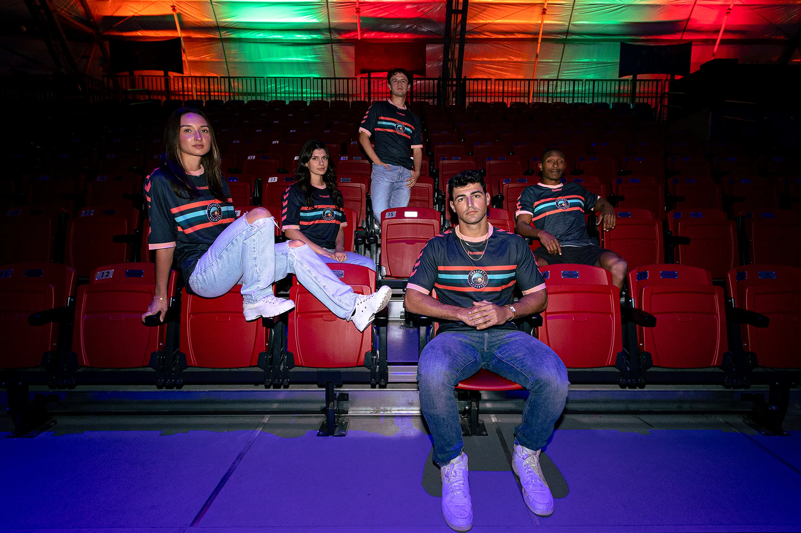
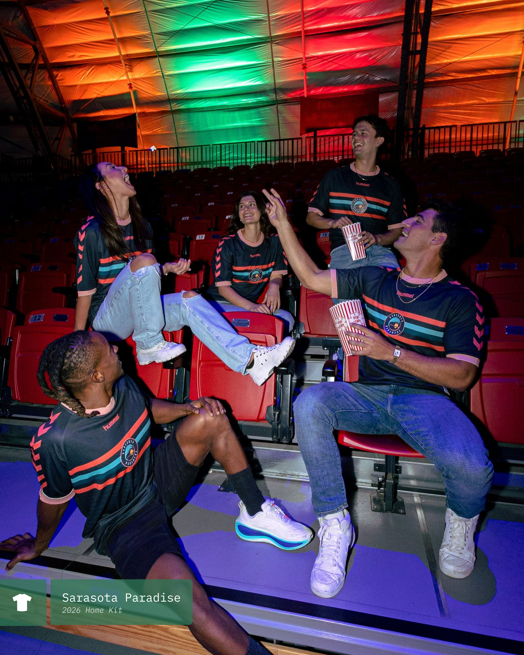
The Sarasota Paradise of USL League one have released their new 2026 Primary kit called "The Primetime Streak".
This kit features Paradise's iconic stripes across the chest - a look that has been with them since their inception. This version of the kit keeps those stripes to the chest and does not carry over on to the areas like it did previously which I think really cleans the kit up quite nicely. In addition to the main stripes, there are horizontal pinstripes as well.
Beyond the different levels of striping, there is also a new ribbed knit collar and cuff which really rounds out the look nicely and provides a really cohesive look. It seems that moving in to the professional divisions has allowed for a more elevated fabric solution which I'm sure the players will appreciate!
This look is very unique and quite iconic at this point. These jerseys are unmistakably Sarasota. I am really looking forward to seeing what the club releases for their 2026 Secondary kit and I have my fingers crossed that they try their hands at a Third kit as well. We will see, the season will be here before we know it!
What are your thoughts on the kit? Let us know in the comments below!

Oakland Roots ‘25 Third Kit
Oct 11, 2025

This September the Oakland Roots Sports Club released a collaboration with SFMOMA, Charly and Oakland based artist Muzae Sesay that saw one of Muzae’s pieces turned into the Roots 2025 Third Kit. The limited runs of kits are inspired by his piece “The Sun Has Reached The Same Point As The Moon Above The Ocean” (shown below) and is accented with a black and gold club crest and gold sponsorship logos.
This is a truly beautiful collaboration between a club and an artist. Beautiful both visually but symbolically as well. To have a piece showcasing the local bay waters, painted by an Oakland based artist, displayed in a local museum and community space - turned into the kit of the local soccer team is… everything.
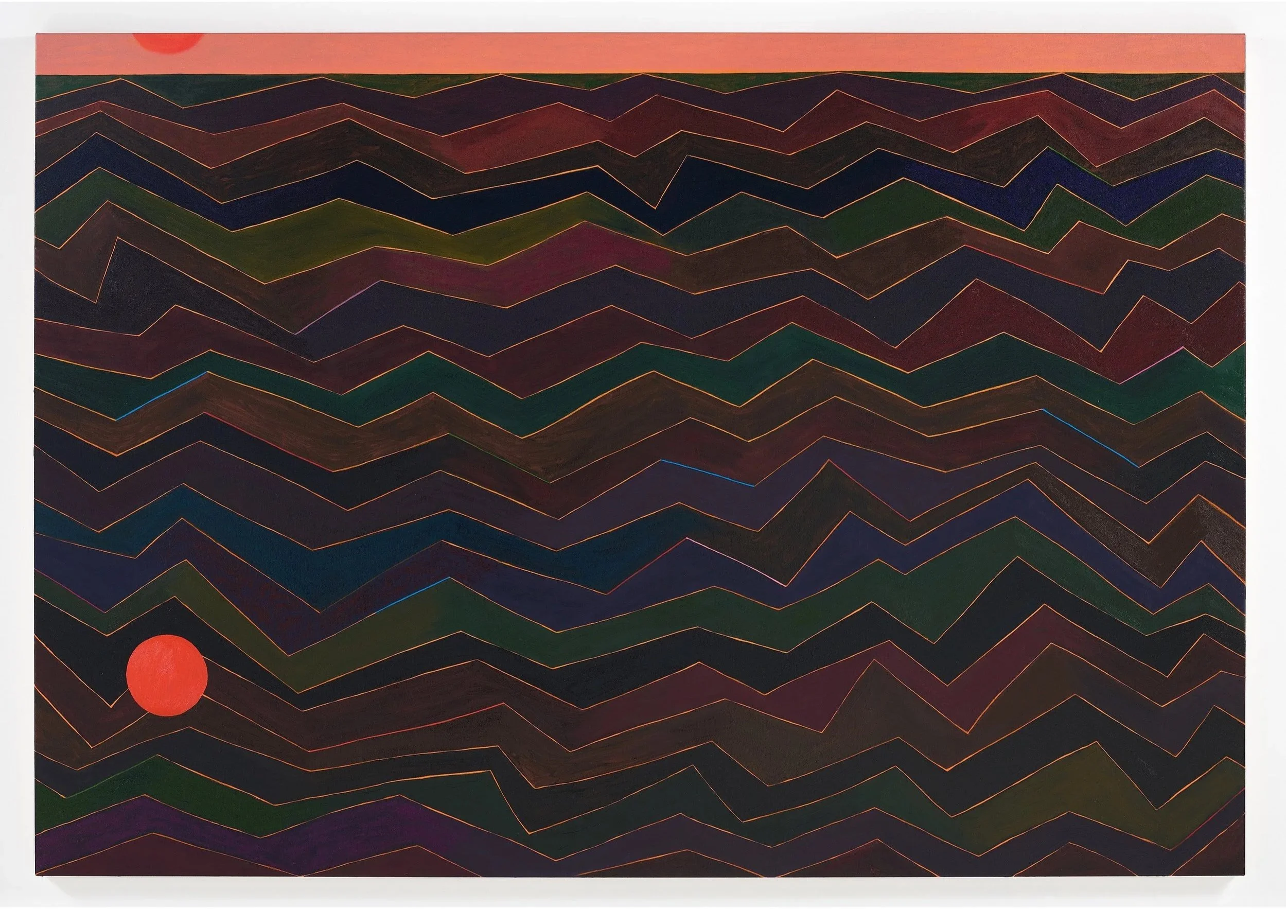
“The Sun Has Reached The Same Point As The Moon Above The Ocean” by Muzae
When interviewed while doing press for the release, Muzae said “My hope with this project is that it leads to greater interconnection between the art world and local sports…” and we couldn’t agree more.
SFMOMA hosted a launch party for the kit that saw the team and fans get together and hear directly from the artist himself while also getting the opportunity to pick up their own limited kits.


At the time of this blog being written, roughly two weeks after the initial release, it does appear as though thus jersey has sold out. Maybe you can pick one up in person (go to a game no matter what!) but they are definitely no longer listed on their website.
Below is the official launch video from Oakland Roots. Like the kit, the video is a vibe!